This article shows you how to click on the map and compare the COVID-19 stats for different communities. We’ll see the large disparities between communities in Los Angeles County.
First, let’s compare cases per 100K people. This is a statistic that’s adjusted for each population, so different size communities can be compared.
Load up the Dashboard from the link above, and then go to the map. Set the 2nd dropdown to “crude”. That’s the cases adjusted for 100k people.
The county’s current cases/population is 678K cases / 10,000K people, 6.78%, or 6,780 per 100,000. My data below was taken a day before today (December 26, 2020).
If you look at East LA, it’s around 11k cases per 100K. In Santa Monica, it’s 2.6K. Pacoima is 12K+. So, East LA is seeing a bit more than 4X as many cases as Santa Monica. Pacioma is 4.8X.
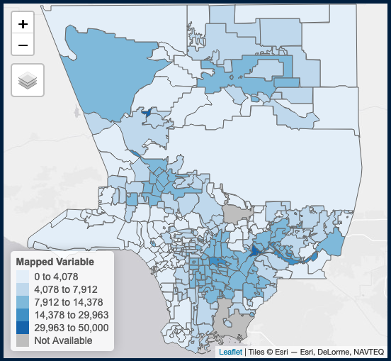
Note that both are dense communities, and can be compared using this crude rate. Places with lower populations will have a less accurate crude rate, because scaling from a small value to large value exaggerates the data. (For example, if you had 5 sick people in a population of 10, the calculated Crude rate would be 50,000 cases out of 100,000 people. That’s obviously not useful for a comparison.)
The population of East LA was 126K in 2010. Santa Monica had 91K in 2018. Pacoima had 104K in 2010. So these areas are comparable in population.
You can compare deaths. Set the first dropdown to “Deaths”.
East LA has 133 deaths per 100K. Santa Monica has 62. So that’s a bit over 2X. Pacoima has 118 deaths, so it’s not as bad, but it’s still 2X worse.
I wondered if there was a big difference in testing, and there wasn’t. 49K in East LA, and 50K in Santa Monica. 52K in Pacoima.
So those case and death numbers might be comparable.
Testing is not all equal everywhere. The San Gabriel Valley has some gaps. Rosemead had 30K tests (per 100K people), which is 3/5ths as much testing as in the three communities above. The area from Torrance to San Pedro is also under-tested. These areas have large Asian communities. You also see low rates of testing in the high desert areas around Palmdale and Lancaster.
You can also use the “Adjusted Rate”, which is age adjusted. I’ve avoided it for this note because I don’t know how the age adjustment works.
The short version: The working class Latino communities are suffering more than the more middle class and affluent, and more white, community. Asian communities and desert communities are under-tested, so the case data in these areas is probably less accurate.
The policy version: our media messaging, and the people doing much of the policy work on this pandemic, are more like the people in Santa Monica than the people in East LA, or the under-tested areas. This could have some effect on the spread of this virus.
I apologize for not digging into the numbers in South Los Angeles, especially the eastside. The area is not as familiar to me as the ones I chose to focus on.


Leave a Reply